Six useful go-to climate services to boost your understanding of climate change
WEMC are excited to introduce this guest blog post, written by Kit Marie Rackley (they/she). Kit Marie is a freelance educator, author, science communicator and teacher trainer with experience working in the climate science sector. They are a consultant to the Geographical Association and the National Association of School-Based Teacher Trainers (NASBTT). Kit Marie’s work can be found at Geogramblings.
This article will look at climate services that are not primarily aimed towards high-school teachers, but can be used as key educational tools on the individual, higher education and business levels. To find out more about climate data visualisations and geographical information systems (GIS) tools that are aimed towards high school and sixth form teachers, click here.
It is becoming increasingly common place that education departments of governments around the world are including climate change in statutory policy. One such example is the recently released Sustainability and climate change: a strategy for the education and children’s services systems by the UK Government’s Department for Education, in which sets out four key strategic aims for its education sector. The first being “Excellence in education and skills for a changing world”. Such excellence can only come from a foundation of authoritative sources and robust understanding in basic principles and terminology. In the case of climate change, this includes climate science, its data, and the visual outputs they create.
The Global Wind and Solar Atlases (World Bank/DTU)
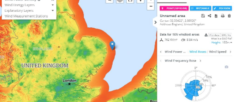
The Global Wind Atlas (GWA) and Global Solar Atlas (GSA) are exceptionally powerful climate service tools, with a user-friendly interface. While the depth and detail you can explore using both these tools is suited for those who work in the energy industry, using their more basic functions can provide for powerful learning on how weather processes and climate can influence energy generation. Clicking on a section of the map brings up graphs of interactive wind speed and direction data (Figure 1).

Users also have the ability to download high-resolution A3 pdf maps of individual countries, allowing for display and group work. The GWA and GWS lend themselves particularly well to enquiry-based and decision-making learning. Using the GWA, student could interpret the choropleth plot to look at patterns of wind speed to make a judgement of suitable places to build a wind farm. More complex enquiry could take place through comparing areas by clicking on them to call up graphical wind speed, direction and other data, allowing to investigate whether offshore wind farms are more or less productive than onshore. Data-backed critical thinking can take place by navigating to an area of conflict (e.g a location of planned wind farm) and analysing its wind data. Combining with other sources of information can help back up or reject stakeholder claims, such as those from anti-wind farm campaigners. The high-resolution output of the GWA allows for analysis on a local scale, such as the impact on wind from topography.
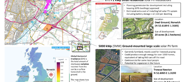
The GSA is put to use as part of an extensive scheme of work package focusing on Climate change mitigation and adaptation, written by the Geographical Association, a charity with several thousand members, the majority of those being educators. The activity in which the GSA is used by students is a decision-making exercise to gather information about potential energy production for a proposed development, where students will give reasoned and substantiated arguments to reach a decision on whether to build a solar PV farm using information from a variety of sources. This is based on real-life examples, using news articles and the opinions of real people, which gives the activity context and realism.

UK Drought Portal (Centre for Ecology & Hydrology – CEH)
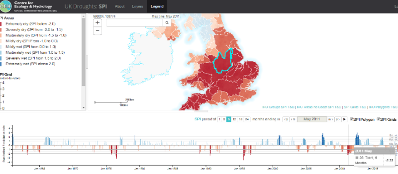
The UK Drought Portal is an interactive application which visualises data through a map and linked charts. The tool uses the Standardized Precipitation Index (SPI) which is an index measure that compares rainfall data over a selected timeframe with the average over a longer one. Negative SPI values represent rainfall deficit; positive SPI values indicate rainfall surplus. The data will also show wet periods, and so the same activities can also be done in relation to flooding and flood risk.

Tools such as the UK Drought Portal can help with understanding and applying terminology, see patterns of change and give detail to real-life case studies. By demonstrating the use of ‘SPI’ as an index, the UK Drought Portal helps students to understand how index measurements work, and by extension use data to help define the term ‘drought’. Using the time-series graphs to look at patterns of past events allow students to investigate and judge whether there is an increase in frequency and or intensity, with regards to extreme weather (i.e. drought/flood) as an indicator of climate change. A specific period of time and area can be selected, allowing for statistics to be collected for a specific event (e.g. Figure 3 shows the UK during the 2011 drought).
Other examples of climate services or climate-related services for educational use
Spending time to dig around the internet will reveal a wealth of these interactive visual ‘services’, with various degrees of educational usefulness. Here are just some examples.
Cyclocane is a global tropical storm tracker consisting of live plots of ‘spaghetti’ tracks. This demonstrates how modelling works and helps to visualise global atmosphere circulation patterns. The plots can be used as inputs for activities such as mock disaster planning with regards to storms.
The National River Flow Archive can be used to obtain data for past flooding events for use in case studies. While in the classroom, mock and simplified hydrographs are studied to understand how rivers react to rainfall events, this can be demonstrated using the tool to produce real hydrographs using actual data. This information can be useful to form the basis of enquires and decision-making into flood management.
The Malaria Atlas Project (MAP Group) allows for analysis of spatial patterns using different layers e.g. population, climate etc, and make predictions and conclusions regarding how these factors control the spread of disease. The data can aid mock disaster planning with regards to epidemics.
The US-based National Oceanic & Atmospheric Administration (NOAA) produce some incredible climate services, some which I was privileged to be involved in when I was on placement at NOAA’s Earth Science Research Lab in Boulder, Colorado towards the end of 2017. Their ‘Decision Makers Toolbox’ contains “videos highlighting tools & data for climate-smart decisions”.
Concluding thoughts
The climate service tools outlined by Kit are indispensable for individual and group climate education and action, to better understand recent policy, scientific and technological developments. The acquisition of theoretical and technical knowledge about seasonal forecasting and climate projections adds practical and economic value to decision-making processes and outcomes related to climate change, energy and water.
To find out more about climate data visualisations and geographical information systems (GIS) tools that are aimed towards high school and sixth form teachers, click here.
To keep up to date with WEMCs events and news, please subscribe to the WEMC newsletter and follow us on Twitter, LinkedIn, and YouTube.


