

Examples of climate and energy data visualisations and how they can be used in the classroom
WEMC are excited to introduce this guest blog post, written by Kit Marie Rackley (they/she). Kit Marie is a freelance educator, author, science communicator and teacher trainer with experience working in the climate science sector. They are a consultant to the Geographical Association and the National Association of School-Based Teacher Trainers (NASBTT). Kit Marie’s work can be found at Geogramblings.
It is becoming increasingly common place that education departments of governments around the world are including climate change in statutory policy. One such example is the recently released Sustainability and climate change: a strategy for the education and children’s services systems by the UK Government’s Department for Education, in which sets out four key strategic aims for its education sector. The first being “Excellence in education and skills for a changing world”. Such excellence can only come from a foundation of authoritative sources and robust understanding in basic principles and terminology. In the case of climate change, this includes climate science, its data, and the visual outputs they create.
Educators at the secondary phase of education, particularly in the subject areas of Science and Geography, are embracing the use of robust climate data and visualisations from authoritative sources, with some even going so far as to use climate services that aren’t designed for school-use within their teaching. In 2019, I wrote an article for a journal popular with secondary Geography educators defining what is meant by climate services and giving examples of how they could be used in a high-school setting – some of which I will revisit and take a fresh look here. The article and other case studies have been cited to demonstrate that an increasing number of educators are using similar tools in their teaching to ensure the data being using is robust and from authoritative sources.
This article will look at two groups of climate visualisations and their potential applications in the classroom: climate services that are not primarily aimed towards high-school teachers, and climate data visualisations and geographical information systems (GIS) tools that are.
Climate services: powerful learning potential direct from authoritative sources
The Global Wind and Solar Atlases (World Bank/DTU)
The Global Wind Atlas (GWA) and Global Solar Atlas (GSA) are exceptionally powerful climate service tools, with a user-friendly interface. While the depth and detail you can explore using both these tools is suited for those who work in the energy industry, using their more basic functions can provide for powerful learning on how weather processes and climate can influence energy generation. Clicking on a section of the map brings up graphs of interactive wind speed and direction data (Figure 1).

Users also have the ability to download high-resolution A3 pdf maps of individual countries, allowing for display and group work. The GWA and GWS lend themselves particularly well to enquiry-based and decision-making learning. Using the GWA, student could interpret the choropleth plot to look at patterns of wind speed to make a judgement of suitable places to build a wind farm. More complex enquiry could take place through comparing areas by clicking on them to call up graphical wind speed, direction and other data, allowing to investigate whether offshore wind farms are more or less productive than onshore. Data-backed critical thinking can take place by navigating to an area of conflict (e.g a location of planned wind farm) and analysing its wind data. Combining with other sources of information can help back up or reject stakeholder claims, such as those from anti-wind farm campaigners. The high-resolution output of the GWA allows for analysis on a local scale, such as the impact on wind from topography.
The GSA is put to use as part of an extensive scheme of work package focusing on Climate change mitigation and adaptation, written by the Geographical Association, a charity with several thousand members, the majority of those being educators. The activity in which the GSA is used by students is a decision-making exercise to gather information about potential energy production for a proposed development, where students will give reasoned and substantiated arguments to reach a decision on whether to build a solar PV farm using information from a variety of sources. This is based on real-life examples, using news articles and the opinions of real people, which gives the activity context and realism.

UK Drought Portal (Centre for Ecology & Hydrology – CEH)
The UK Drought Portal is an interactive application which visualises data through a map and linked charts. The tool uses the Standardized Precipitation Index (SPI) which is an index measure that compares rainfall data over a selected timeframe with the average over a longer one. Negative SPI values represent rainfall deficit; positive SPI values indicate rainfall surplus. The data will also show wet periods, and so the same activities can also be done in relation to flooding and flood risk.

Tools such as the UK Drought Portal can help with understanding and applying terminology, see patterns of change and give detail to real-life case studies. By demonstrating the use of ‘SPI’ as an index, the UK Drought Portal helps students to understand how index measurements work, and by extension use data to help define the term ‘drought’. Using the time-series graphs to look at patterns of past events allow students to investigate and judge whether there is an increase in frequency and or intensity, with regards to extreme weather (i.e. drought/flood) as an indicator of climate change. A specific period of time and area can be selected, allowing for statistics to be collected for a specific event (e.g. Figure 3 shows the UK during the 2011 drought).
Other examples of climate services or climate-related services for educational use
Spending time to dig around the internet will reveal a wealth of these interactive visual ‘services’, with various degrees of educational usefulness. Here are just some examples.
Cyclocane is a global tropical storm tracker consisting of live plots of ‘spaghetti’ tracks. This demonstrates how modelling works and helps to visualise global atmosphere circulation patterns. The plots can be used as inputs for activities such as mock disaster planning with regards to storms.
The National River Flow Archive can be used to obtain data for past flooding events for use in case studies. While in the classroom, mock and simplified hydrographs are studied to understand how rivers react to rainfall events, this can be demonstrated using the tool to produce real hydrographs using actual data. This information can be useful to form the basis of enquires and decision-making into flood management.
The Malaria Atlas Project (MAP Group) allows for analysis of spatial patterns using different layers e.g. population, climate etc, and make predictions and conclusions regarding how these factors control the spread of disease. The data can aid mock disaster planning with regards to epidemics.
The US-based National Oceanic & Atmospheric Administration (NOAA) produce some incredible climate services, some which I was privileged to be involved in when I was on placement at NOAA’s Earth Science Research Lab in Boulder, Colorado towards the end of 2017. Their ‘Decision Makers Toolbox’ contains “videos highlighting tools & data for climate-smart decisions”.
Tools for schools: putting authoritative sources to use through an educational lens
While many teachers are confident and creative enough to take tools not designed for them like the climate service examples above, and generate their own learning resources based on them, there a few examples which are designed with educational use in mind. These tools also use authoritative climate data but the expertise of the developers and their collaboration with teachers ensure that they are not only accessible to a younger audience, but allow teachers to continue being creative with how they use them.
Climate and Climate Change in the UK (Esri UK Education Team & The Met Office)
Esri are a well-known global developer of geographical information systems (GIS). Their UK & Ireland branch have a dedicated education team which support schools, including offering their wonderful ‘ArcGIS for Schools’ platform for free. Esri UK have teamed up with The Met Office to produce a series of GIS story maps demonstrating climate change in the UK, impacts and adaptation. A story map is a webpage that you scroll from top to bottom, taking you through an interactive narrative. As the name suggests, these interactive elements are often GIS maps. The combination of Esri UK’s GIS expertise, and the authoratitive and robust climate data based on research from The Met Office has resulted in a series of story maps that can be used as-is for learning, either directed by the teacher or explored by students themselves. There are plans to develop ‘off the shelf’ learning resources and worksheets in the near future.
It is strongly recommended that you take a look at the story maps yourselves, such is the depth and breadth of what is on offer. Here, I’ll take a look at just one example from the ‘Transport and Climate’ page in the ‘Impacts and Adaptations’ story map (Figure 4).

The data which informs the ‘Railway Adverse Weather Days Per Year’ maps is sourced from the Hadley Centre HadGEM3 climate model projections, which have undergone extensive analysis and peer review. ‘Railway adverse weather days’ are defined as the mean number of days per year where the maximum temperature is above 25°C, or the minimum below -3°C, or daily rainfall is greater than 40mm, or snow-depth is greater than 50mm. These weather conditions have been judged to be problematic for rail travel. High air temperatures can cause heating of the steel tracks, increasing the risk of buckling. Overhead powerlines can sag and cause issues for power transition to trains. Freezing temperatures and snow can cause tracks to ice up, causing delays. High levels of rainfall increase the chance of surface water flooding – 596 railway stations and 3,544km of rain network is at risk from this. Heavy rain can also cause landslides and subsidence in hilly areas, with the failing slopes covering roads and railways. The interactive modules clearly show that the number of days per year where the conditions are ‘adverse’ to rail travel is increasing across the UK, but also that this pattern is not uniform. The networks which include London as a hub is a particular problem area especially since there are millions of journeys taken on those systems every day.
Learning about and investigating the link between climate change and different sectors such as transport is part of many syllabuses in UK and European Geography syllabuses in particular. Those syllabuses also challenge students to think about how technology can be used and people’s lifestyles changed to reduce impacts. Tools such as the Esri UK story maps provide a wealth of high-quality visual outputs based on robust climate data to aid this learning and exploration.
Increasingly, science and research-based organisations such as The Met Office have dedicated teams working on educational outreach and material, using their research outputs. A set of materials for students to work on their Maths and Science can be found on their website, for instance.
Digimap for Schools (EDINA)
Digimap for Schools is an online subscription tool which allows schools licenced digital access to many different map layers including the full suite of British Ordnance Survey maps. The interface is very user friendly and the tools simple to use that it can be used by children of primary-school age as well as be powerful enough for deeper spatial analysis by older students. A few months ago, EDINA, the operators of Digimap for Schools, added a new ‘world climate’ layer (Figure 5).

The data that makes up comes from a range of reliable sources from WorldClim and reviewed in the International Journal of Climatology. There are seven layers. Four display average global temperature in the ‘near past’ (1970-2000), ‘recent’ (2010-2018), ‘near future’ (2021-2040) minimums and maximums. Three display average precipitation also in those timescales. The projections are based on ‘middle of the road’ climate changes of a global warming of 2.1 to 3.5°C by 2100, which arguably is what the world is heading for the way things are going!
All students need to do is turn on or off layers, or adjust the transparency of layers to explore the global patterns of temperature or precipitation. Some investigation work can take place such as looking at where in the world the average temperatures might switch from below or around freezing, to just above freezing (Figure 6).

Utilising other layers on the tools can allow for the investigation of patterns between them. For example, using the global biome layer students can the transparency function to switch to and from a climate layer to see how those biomes relate to the climate. And then when looking at the projections of temperature and precipitation, could there be any biomes which would see changes to a climate that doesn’t suit them? Students can see the potential ‘poleward’ shift for themselves which can lead to deeper discussions about what impacts this might have on ecosystems and human systems that rely on them. Another layer that is useful to compare with the climate layers is population density. Zooming in on areas of high density, such as Bangladesh, and seeing the increase in heat and rainfall is an indication that many people in that part of the world will be at increased risk of heatwaves and flooding.
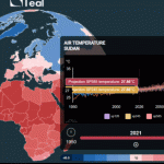
Bridging the gap: WEMC’s Teal Tool
WEMC’s Teal Tool is an ‘educational evolution’ of a climate service developed for educational purposes. It is specifically designed to raise awareness about our changing climate using robust climate data such as ERA5 to display temperature, wind speeds, precipitation, solar radiation and carbon emissions across the globe. Both the spatial and temporal scales are changeable, allowing the comparisons between regions within countries, seasons or even months.
Teal has its origins in the comprehensive ECEM Demonstrator tool and the award-winning C3S Climate & Energy Education Demonstrator. I’m excited to see the further evolution of Teal and its educational applications.

Closing thoughts
From the point of view as an ex-teacher, what becomes apparent from this article is that ‘climate services’ are fundamentally GIS and ‘interactive maps’, and so teachers already use numerous such applications already, often extensively. The examples given here may be quite complex GIS applications when you go in depth; but the creativity and resourcefulness of the teacher, plus the teaching ideas suggested proves that this doesn’t matter. And even so, agencies and organisations who involved in the creation of such services are now developing similar tools with an educational purpose and school students in mind. The result are exceptionally powerful tools and which can cover a number of content and skill requirements, allowing our young people to get to grips with the same information that the expert use to conduct life-changing research. Isn’t that something!
To keep up to date with WEMCs events and news, please subscribe to the WEMC newsletter and follow us on Twitter, LinkedIn, and YouTube.
