

Tech Blog 7: Plot a map with Eurostat NUTS2 regions in 7 easy steps
During our continued work on the C3S Energy project (a component of Copernicus Climate Change), we’ve been using Eurostat NUTS areas (nomenclature of territorial units for statistics) to define our European regions, both at country (NUTS0) and regional (NUTS2) levels.
Whilst there are plenty of resources available online for identifying the NUTS0 areas, there isn’t much out there detailing the NUTS2 regions and where they appear on a map.
After some research and experimentation at the behest of one of our colleagues, we were able to generate the resource here as a high resolution png file. Read on to find out how we did it.
How to show NUTS2 regions on a map
In this tutorial we will go though a workflow to produce a map with labelled regions. This should work for any geographic shapefiles.
Step one
Using Jupyter Notebooks, import the following packages:
[pastacode lang=”python” manual=”%23%20import%20packages%0Aimport%20geopandas%20as%20gpd%0Aimport%20matplotlib.pyplot%20as%20plt%0Afrom%20descartes%20import%20PolygonPatch%0Aimport%20shapefile%0Aimport%20cartopy.crs%20as%20ccrs%0Aimport%20cartopy.feature%20as%20cfeature%0Afrom%20matplotlib.offsetbox%20import%20AnchoredText” message=”” highlight=”” provider=”manual”/]Step two
Load up your NUTS shapefile (obtain from eurostat)
[pastacode lang=”python” manual=”%23%20read%20the%20NUTS%20shapefile%20and%20extract%20the%20polygons%20for%20a%20individual%20countries%0Anuts%3Dgpd.read_file(‘%2Fpath%2Fto%2Fyour%2Fshapefiles%2FNUTS_RG_10M_2016_4326_LEVL_2.shp’)” message=”” highlight=”” provider=”manual”/]Step three
The next piece of code defines a central point within each shape for labelling use
[pastacode lang=”python” manual=”%23%20use%20representitive_point%20method%20to%20obtain%20point%20from%20within%20each%20shapefile%0A%23%20creates%20new%20column%20’coords’%20containing%20the%20representitive%20points%0Anuts%5B’coords’%5D%20%3D%20nuts%5B’geometry’%5D.apply(lambda%20x%3A%20x.representative_point().coords%5B%3A%5D)%0Anuts%5B’coords’%5D%20%3D%20%5Bcoords%5B0%5D%20for%20coords%20in%20nuts%5B’coords’%5D%5D” message=”” highlight=”” provider=”manual”/]Step four
Using matplotlib, plot the map.
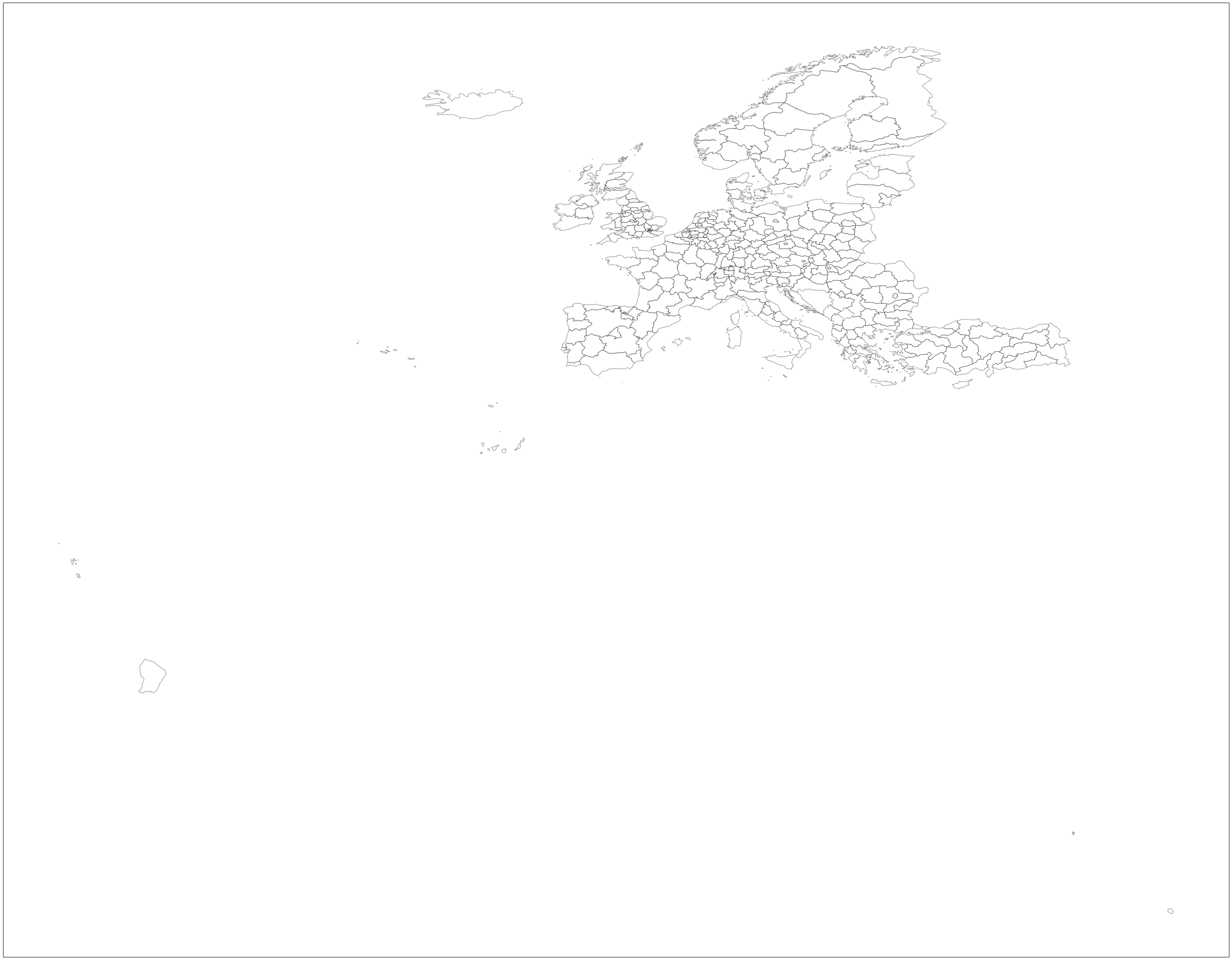
[pastacode lang=”python” manual=”sf%3Dshapefile.Reader(%22%2FUsers%2Fuser%2FDocuments%2FC3S_Energy_Docs%2FNUTS2%2Fref-nuts-2016-10m.shp%2FNUTS_RG_10M_2016_4326_LEVL_2.shp%22)%0Adef%20main()%3A%0A%20%20%20%20fig%20%3D%20plt.figure(figsize%3D(80%2C40))%20%0A%20%20%20%20%0A%20%20%20%20ax%20%3D%20fig.add_subplot(1%2C%201%2C%201%2C%20projection%3Dccrs.PlateCarree())%0A%20%20%20%20%0A%20%20%20%20for%20poly%20in%20sf.shapes()%3A%0A%20%20%20%20%20%20%20%20poly_geo%3Dpoly.__geo_interface__%0A%20%20%20%20%20%20%20%20ax.add_patch(PolygonPatch(poly_geo%2C%20fc%3D’%23ffffff’%2C%20ec%3D’%23000000’%2C%20alpha%3D0.5%2C%20zorder%3D2%20))%0A%20%20%20%20ax.axis(‘scaled’)%0A%0A%0Aif%20__name__%20%3D%3D%20’__main__’%3A%0A%20%20%20%20main()” message=”” highlight=”” provider=”manual”/]And that’s it, we’ve plotted the NUTS2 regions!
But as you can see, it still needs some tweaking to make the regions clearer for the user.
Step five
Let’s first change the map x,y limits to focus on the EU domain.
[pastacode lang=”python” manual=”sf%3Dshapefile.Reader(%22%2FUsers%2Fuser%2FDocuments%2FC3S_Energy_Docs%2FNUTS2%2Fref-nuts-2016-10m.shp%2FNUTS_RG_10M_2016_4326_LEVL_2.shp%22)%0Adef%20main()%3A%0A%20%20%20%20fig%20%3D%20plt.figure(figsize%3D(80%2C40))%20%0A%20%20%20%20%0A%20%20%20%20ax%20%3D%20fig.add_subplot(1%2C%201%2C%201%2C%20projection%3Dccrs.PlateCarree())%0A%20%20%20%20%0A%20%20%20%20for%20poly%20in%20sf.shapes()%3A%0A%20%20%20%20%20%20%20%20poly_geo%3Dpoly.__geo_interface__%0A%20%20%20%20%20%20%20%20ax.add_patch(PolygonPatch(poly_geo%2C%20fc%3D’%23ffffff’%2C%20ec%3D’%23000000’%2C%20alpha%3D0.5%2C%20zorder%3D2%20))%0A%20%20%20%20ax.axis(‘scaled’)%0A%20%20%20%20%0A%20%20%20%20%23%20adjust%20plot%20domain%20to%20focus%20on%20EU%20region%0A%20%20%20%20plt.xlim(-25%2C%2047)%0A%20%20%20%20plt.ylim(30%2C%2073)%20%20%20%0A%0Aif%20__name__%20%3D%3D%20’__main__’%3A%0A%20%20%20%20main()” message=”” highlight=”” provider=”manual”/]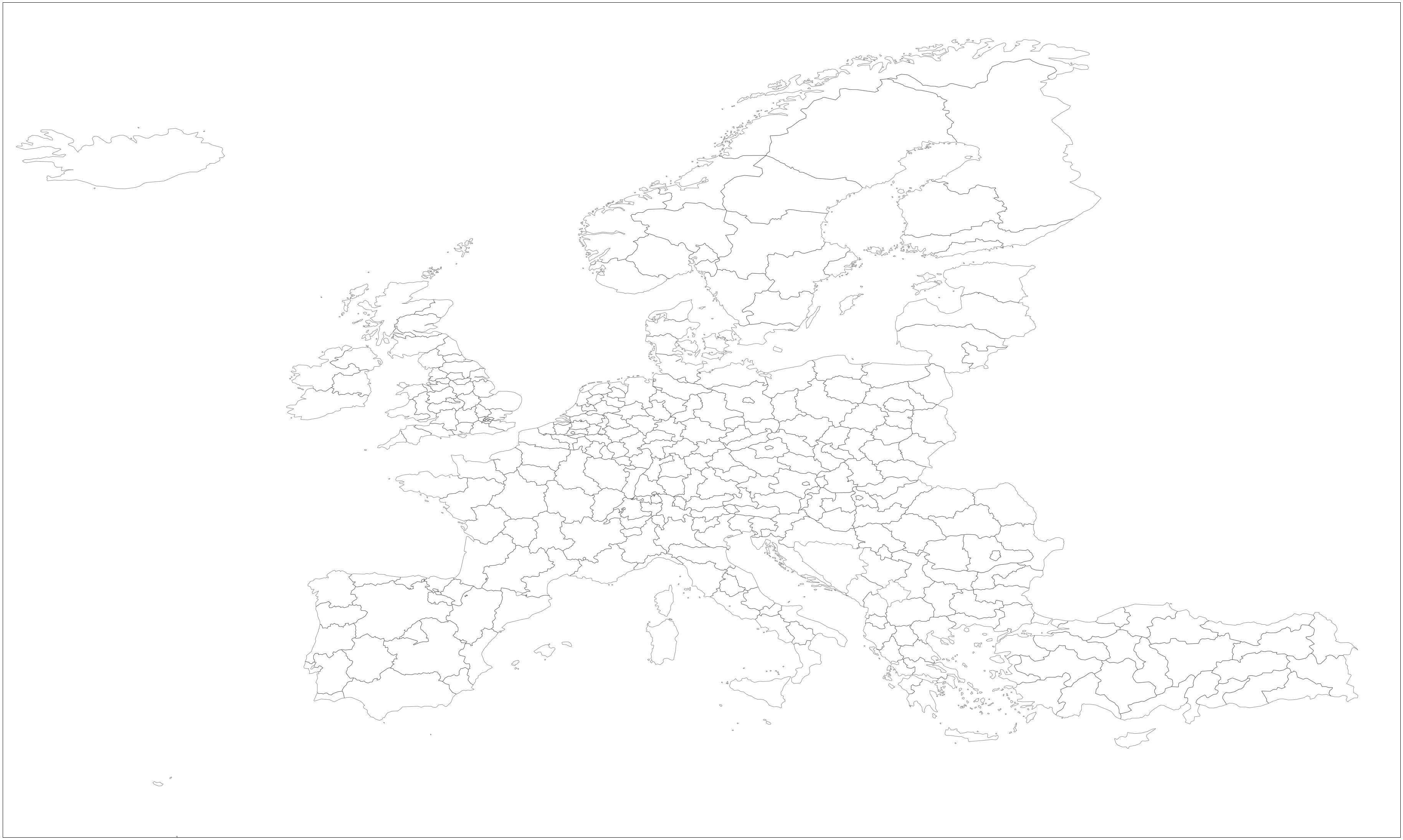
Step six
Then Matplotlib can call the open source natural earth map resources for use as map elements (such as land/sea areas etc).
[pastacode lang=”python” manual=”sf%3Dshapefile.Reader(%22%2FUsers%2Fuser%2FDocuments%2FC3S_Energy_Docs%2FNUTS2%2Fref-nuts-2016-10m.shp%2FNUTS_RG_10M_2016_4326_LEVL_2.shp%22)%0Adef%20main()%3A%0A%20%20%20%20fig%20%3D%20plt.figure(figsize%3D(80%2C40))%20%0A%20%20%20%20%0A%20%20%20%20ax%20%3D%20fig.add_subplot(1%2C%201%2C%201%2C%20projection%3Dccrs.PlateCarree())%0A%20%20%20%20%23hi%20res%20polygons%20for%20land%2C%20sea%20etc%0A%20%20%20%20ax.coastlines(resolution%3D’10m’%2C%20color%3D’black’%2C%20linewidth%3D1)%0A%20%20%20%20ax.natural_earth_shp(name%3D’land’%2C%20resolution%3D’10m’%2C%20category%3D’physical’)%0A%20%20%20%20ax.natural_earth_shp(name%3D’ocean’%2C%20resolution%3D’50m’%2C%20category%3D’physical’%2Cfacecolor%3D’lightblue’)%0A%20%20%20%20%0A%20%20%20%20for%20poly%20in%20sf.shapes()%3A%0A%20%20%20%20%20%20%20%20poly_geo%3Dpoly.__geo_interface__%0A%20%20%20%20%20%20%20%20ax.add_patch(PolygonPatch(poly_geo%2C%20fc%3D’%23ffffff’%2C%20ec%3D’%23000000’%2C%20alpha%3D0.5%2C%20zorder%3D2%20))%0A%20%20%20%20ax.axis(‘scaled’)%0A%20%20%20%20%0A%20%20%20%20%23%20adjust%20plot%20domain%20to%20focus%20on%20EU%20region%0A%20%20%20%20plt.xlim(-25%2C%2047)%0A%20%20%20%20plt.ylim(30%2C%2073)%20%20%20%0A%0Aif%20__name__%20%3D%3D%20’__main__’%3A%0A%20%20%20%20main()” message=”” highlight=”” provider=”manual”/]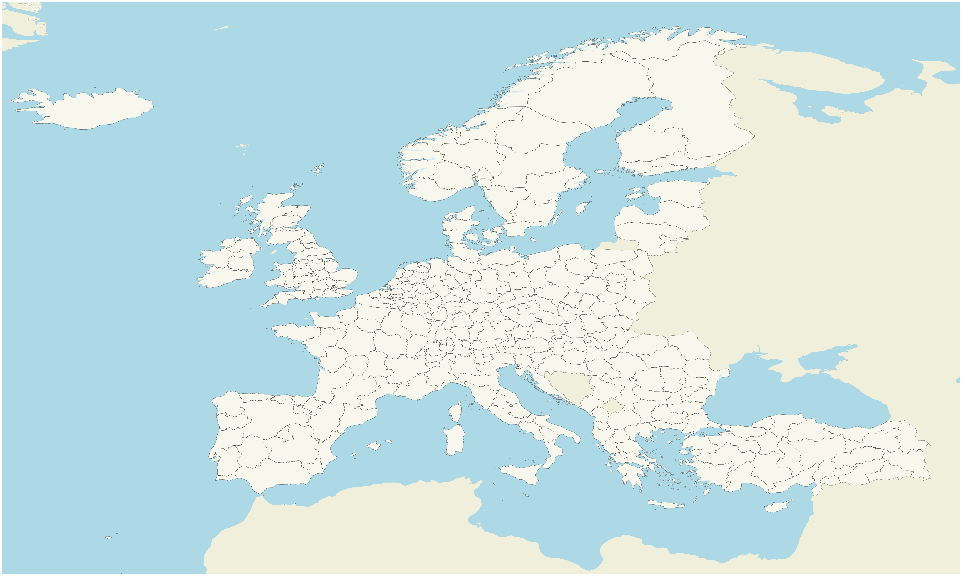
Step seven
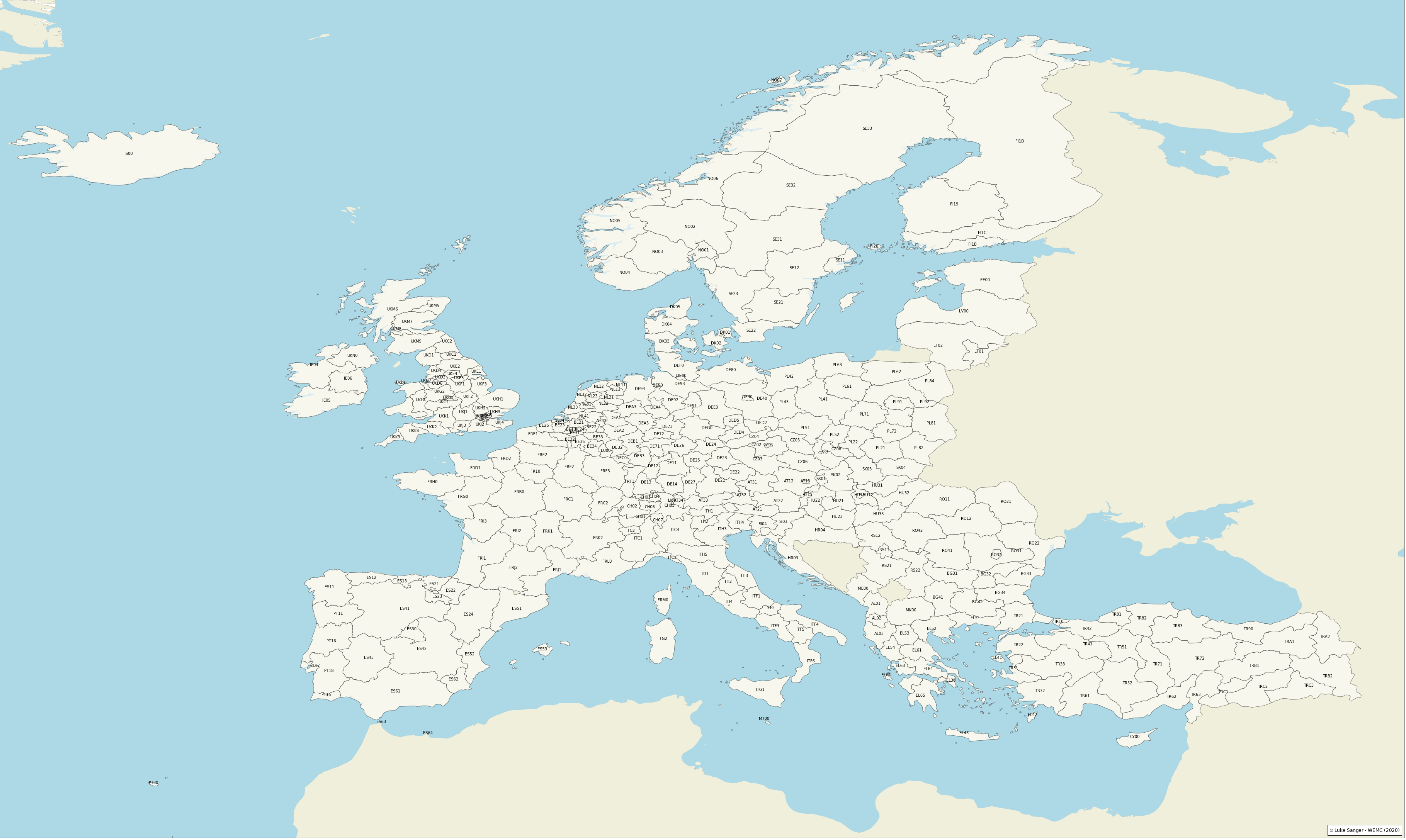
Finally, looping through the central points in the shapefiles as defined earlier, gives us the labelling for each NUTS2 area.
[pastacode lang=”python” manual=”sf%3Dshapefile.Reader(%22%2Fpath%2Fto%2Fyour%2Fshapefiles%2Fref-nuts-2016-10m.shp%2FNUTS_RG_10M_2016_4326_LEVL_2.shp%22)%0Adef%20main()%3A%0A%20%20%20%20fig%20%3D%20plt.figure(figsize%3D(80%2C40))%20%0A%20%20%20%20%0A%20%20%20%20ax%20%3D%20fig.add_subplot(1%2C%201%2C%201%2C%20projection%3Dccrs.PlateCarree())%0A%20%20%20%20%0A%20%20%20%20%23hi%20res%20polygons%20for%20land%2C%20sea%20etc%0A%20%20%20%20ax.coastlines(resolution%3D’10m’%2C%20color%3D’black’%2C%20linewidth%3D1)%0A%20%20%20%20ax.natural_earth_shp(name%3D’land’%2C%20resolution%3D’10m’%2C%20category%3D’physical’)%0A%20%20%20%20ax.natural_earth_shp(name%3D’ocean’%2C%20resolution%3D’50m’%2C%20category%3D’physical’%2Cfacecolor%3D’lightblue’)%0A%0A%20%20%20%20%0A%20%20%20%20for%20poly%20in%20sf.shapes()%3A%0A%20%20%20%20%20%20%20%20poly_geo%3Dpoly.__geo_interface__%0A%20%20%20%20%20%20%20%20ax.add_patch(PolygonPatch(poly_geo%2C%20fc%3D’%23ffffff’%2C%20ec%3D’%23000000’%2C%20alpha%3D0.5%2C%20zorder%3D2%20))%0A%20%20%20%20ax.axis(‘scaled’)%0A%0A%20%20%20%20%23%20annotate%20plot%20with%20NUTS_ID%20%0A%20%20%20%20for%20idx%2C%20row%20in%20nuts.iterrows()%3A%0A%20%20%20%20%20%20%20%20plt.annotate(s%3Drow%5B’NUTS_ID’%5D%2C%20xy%3Drow%5B’coords’%5D%2C%20horizontalalignment%3D’center’)%0A%0A%20%20%20%20%23%20adjust%20plot%20domain%20to%20focus%20on%20EU%20region%0A%20%20%20%20plt.xlim(-25%2C%2047)%0A%20%20%20%20plt.ylim(30%2C%2073)%20%20%20%20%20%0A%0A%20%20%20%20%23%20Add%20a%20text%20annotation%20for%20the%20license%20information%20to%20the%0A%20%20%20%20%23%20the%20bottom%20right%20corner.%0A%20%20%20%20text%20%3D%20AnchoredText(r’%24%5Cmathcircled%7B%7Bc%7D%7D%24%20Luke%20Sanger%20-%20WEMC%20(2020)’%2Cloc%3D4%2C%20prop%3D%7B’size’%3A%2012%7D%2C%20frameon%3DTrue)%0A%20%20%20%20ax.add_artist(text)%0A%20%20%20%20plt.show()%0A%0Aif%20__name__%20%3D%3D%20’__main__’%3A%0A%20%20%20%20main()” message=”” highlight=”” provider=”manual”/]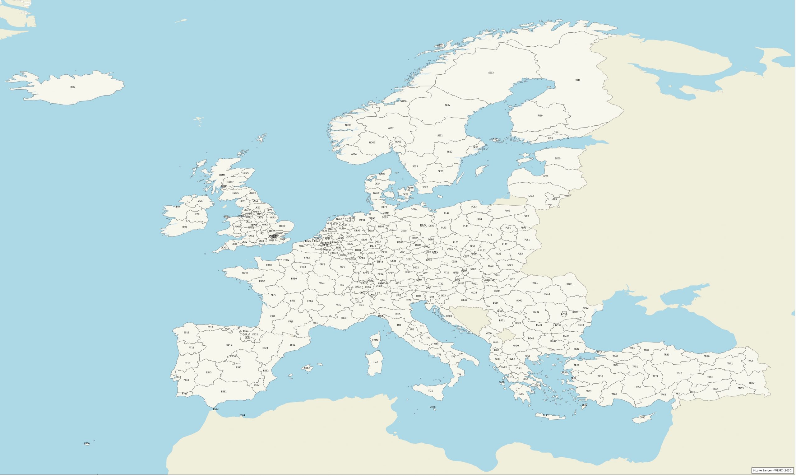
There you have it.
We know that the London regions are quite densely clustered at this level and as a result, the labels are overlapping, so it’s not ideal. But this does demonstrate one way you can visualize NUTS2 Eurostat regions in the EU domain.
Luke Sanger (WEMC Data Engineer)


