TECH BLOG 6.5: Smoothing plots with Python, Matplotlib and ERA5 Temperature Data for UK Regions
Building on the same techniques as discussed in our last tech blog 6, which focused on using python and matplotlib to plot ERA5 temperature data in West Africa. These plots illustrate the effect of gaussian filter smoothing on hourly ERA5 temperature data, obtained from the Climate Data Store. Gaussian filters are linear and typically used to reduce noise.
The data is averaged by regional areas of the UK, using NUTS2 regional areas shape files. To see how to use NUTS shapefiles can be used for this purpose, see our earlier tech blog covering this.
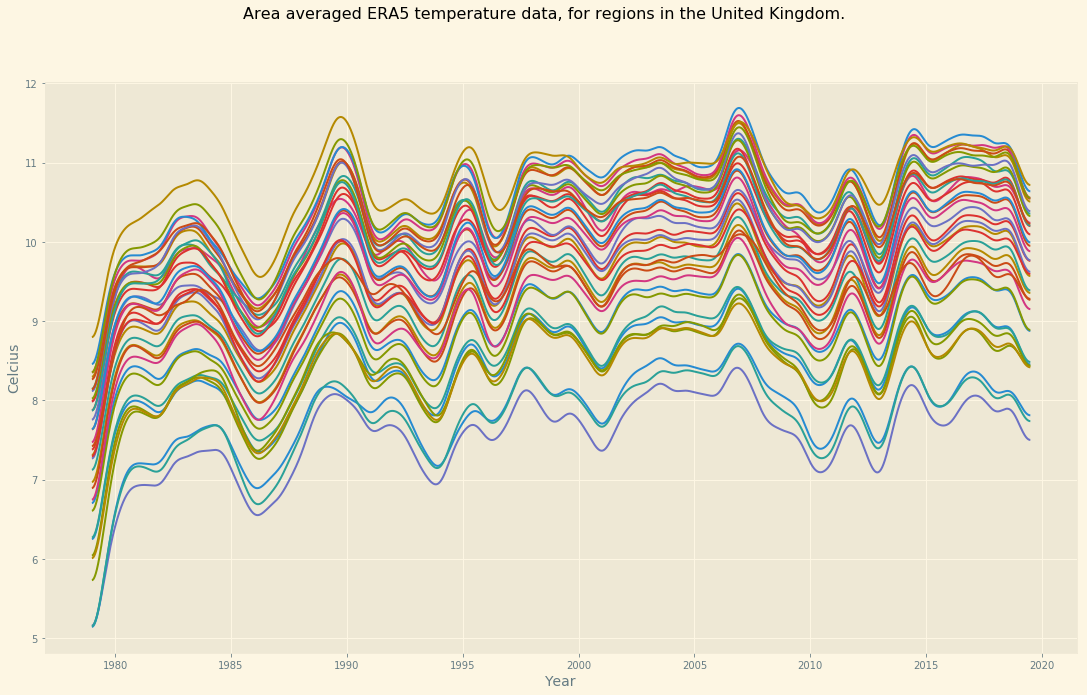
The ERA5 data set is at hourly resolution and when plotted over the entire range (1979 – 2019), the resultant plot is noisy and difficult to see any separation for identifying trends, especially when multiple regions are being plotted at once.
Using the gaussian_filter1d function in matplotlib, it’s possible to smooth out the plot lines for easier visualisation, which can uncover any trends, if they exist.
By the final plot (sigma=100000) , it’s clear on average that the overall temperature on average has increased over time.
Bear in mind, the higher the sigma value, the longer it will take to render the plot.
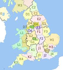
NUTS2 regions
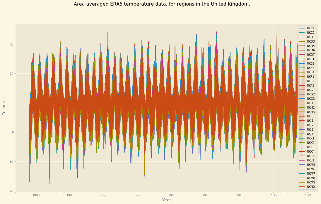
no smoothing
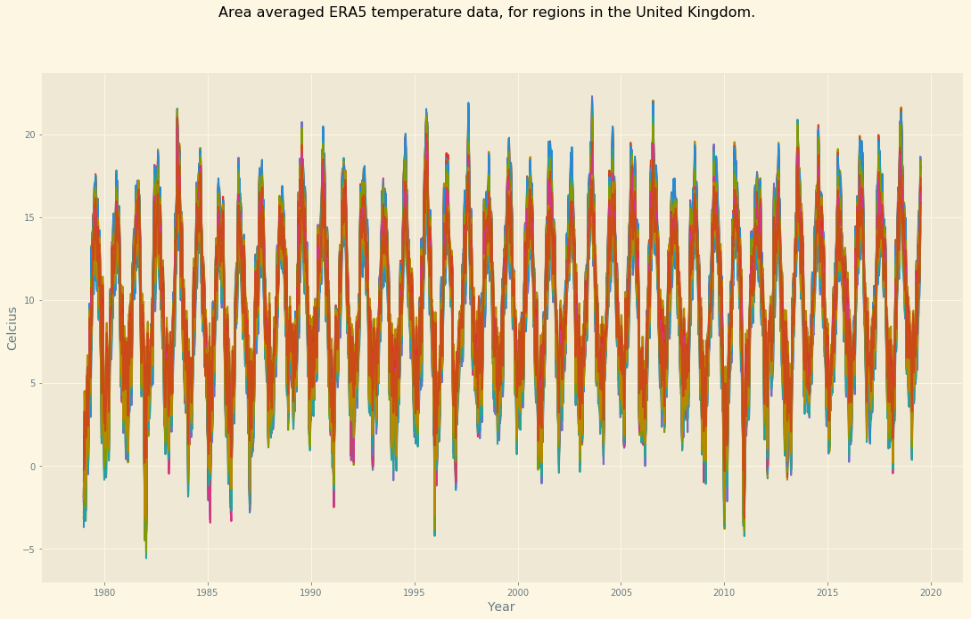
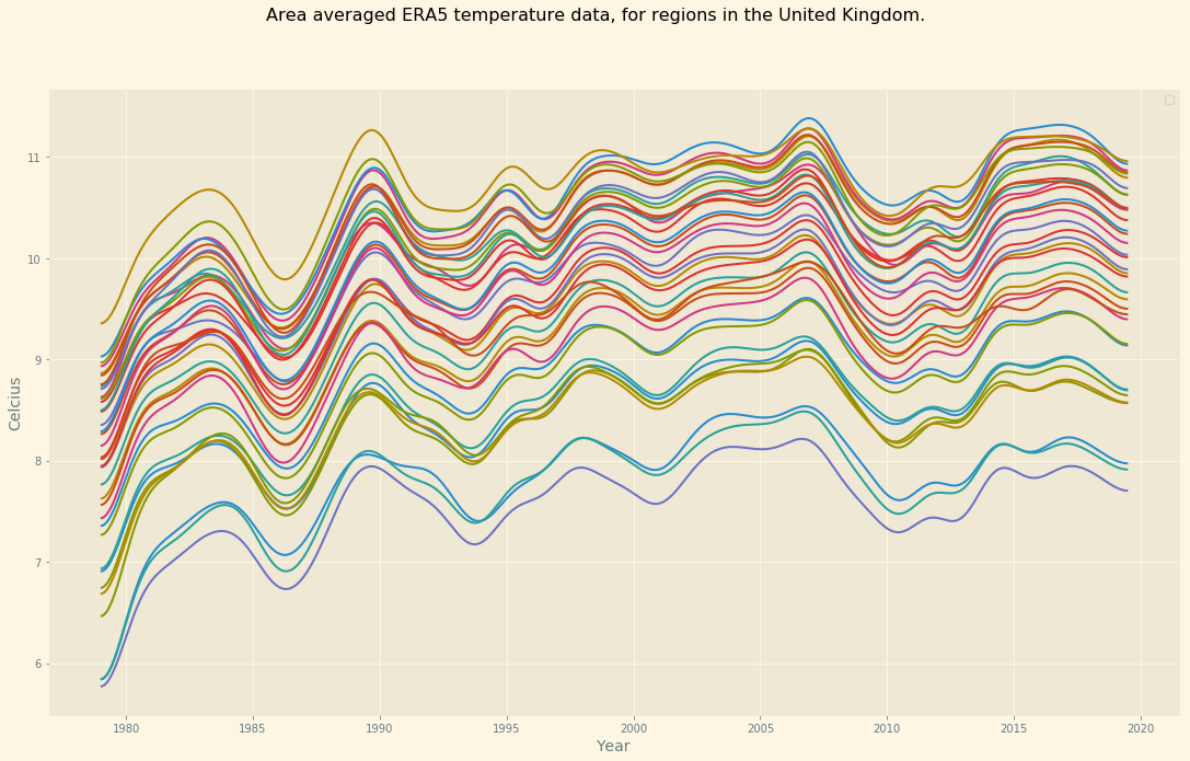
sigma=100
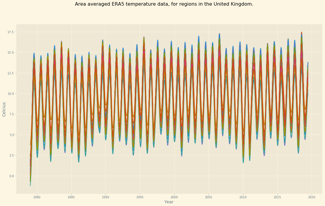
sigma=1000
sigma=5000
sigma=8000
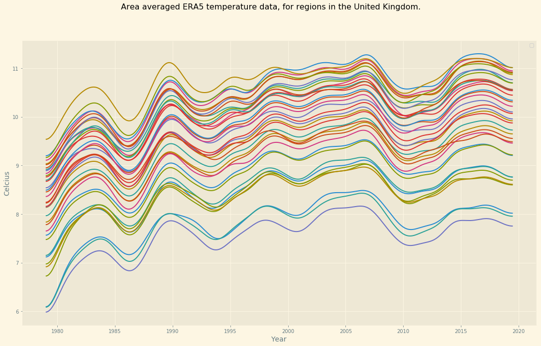
sigma=10000
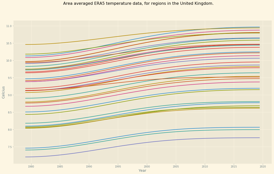
sigma=100000
See the code at my github page
Download the NUTS2 temperature dataset here
Luke Sanger (2019) – WEMC Data Engineer